
Dining room lighting has two jobs: it should make food, finishes, and faces look inviting, and it should support the atmosphere of the room. Color temperature plays a major part in both. A light that is too cool can make an intimate dining space feel clinical, while an extremely warm source may soften colors more than you want.
For many homes, 2700K to 3000K is the most useful starting range for a dining room. Yet the best choice depends on the interior palette, daylight, fixture material, adjacent rooms, and how the space is used. This guide explains what the Kelvin numbers mean and how to make a confident decision.
What color temperature means
Color temperature describes the visual appearance of white light and is measured in kelvins, written as K. Lower numbers look warmer and contain more amber or golden character. Higher numbers appear cooler and can feel cleaner, whiter, or slightly blue by comparison.
Color temperature is different from brightness. A 2700K bulb and a 4000K bulb can produce similar light output while making the room feel very different. It is also different from color rendering, which describes how accurately a light source reveals colors. When planning a chandelier, consider temperature, output, and color quality together.
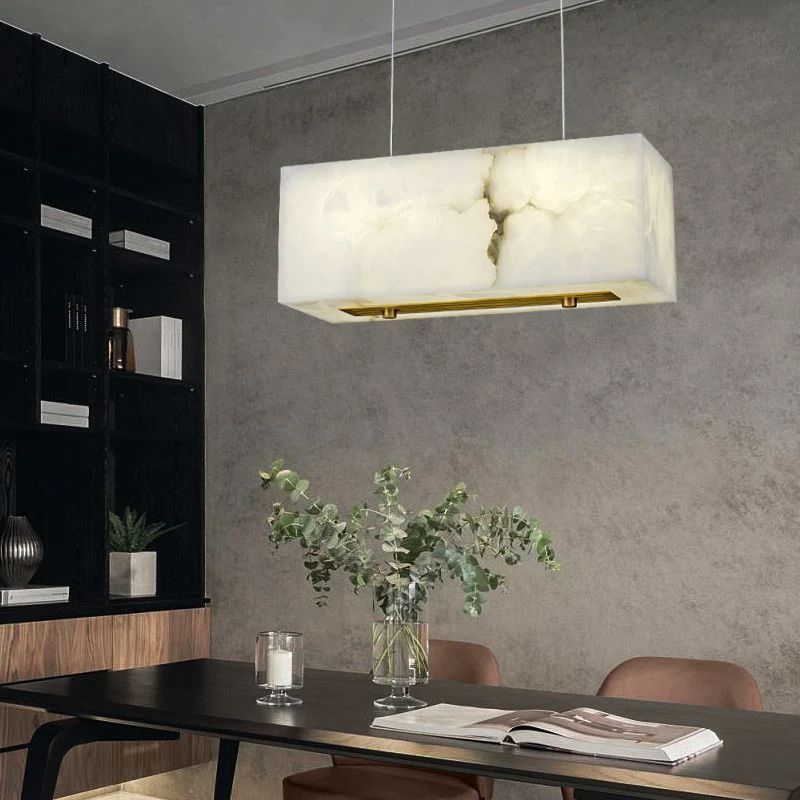
2700K: warm and intimate
Light around 2700K resembles the warm appearance associated with traditional incandescent lighting. It complements wood, brass, cream, warm stone, and many earth-toned interiors. In a formal dining room or an evening-focused space, it can create a relaxed, welcoming impression.
This temperature often works well with an alabaster chandelier because the warm source supports the stone's natural veining and diffused glow. It can also soften crystal or clear glass, reducing the chance that a highly reflective fixture feels severe.
Choose 2700K when the room's purpose is mainly dinner, conversation, and entertaining after dark. Before committing, test it against wall paint and tabletop finishes, because warm light can shift pale neutrals toward cream or beige.
3000K: warm but more neutral
At 3000K, the light still feels warm, but it is usually a little clearer and less amber than 2700K. This balance makes it a versatile choice for contemporary dining rooms, open-plan homes, and spaces that are used during both day and evening.
Three thousand kelvin can suit marble, light oak, gray-beige paint, brass, glass, and mixed contemporary finishes. It is also helpful when the dining area connects directly to a kitchen using similar task lighting. Matching or closely coordinating the temperatures makes the transition feel intentional.
For many shoppers who are uncertain where to begin, 3000K is a practical sample to test. It can maintain a welcoming atmosphere while showing materials with slightly crisper definition.
3500K: a transitional white
Light around 3500K sits between warm residential light and cooler neutral white. It may work in a very modern interior, a multifunctional dining-work area, or an open plan where nearby lighting is already in this range. However, it usually feels less intimate than 2700K or 3000K.
Because 3500K is not always stocked in every bulb style, confirm that the required bulb base, shape, and output are available for the fixture. If a chandelier uses an integrated light source, select only the listed color-temperature option and do not assume it can be changed later.
4000K and above: cooler and more task-oriented
At 4000K, white light appears noticeably cooler in most residential dining rooms. It can make white and gray surfaces feel crisp and may suit a highly contemporary space where the dining table also functions as a workspace. For relaxed evening meals, though, many people find it less inviting than a warm source.
Higher temperatures can also make a warm metal chandelier or wood dining table feel visually separated from the light around it. This does not make 4000K incorrect; it simply means the room, purpose, and neighboring sources must support the choice.
A useful comparison
| Temperature | Typical impression | Dining room use |
|---|---|---|
| 2700K | Warm, amber, intimate | Evening dining and traditional or warm interiors |
| 3000K | Warm, balanced, clear | Versatile contemporary and open-plan rooms |
| 3500K | Neutral transitional white | Multifunctional or cooler modern interiors |
| 4000K | Cooler, crisp, task-focused | Specific contemporary or work-oriented settings |
Consider the chandelier material
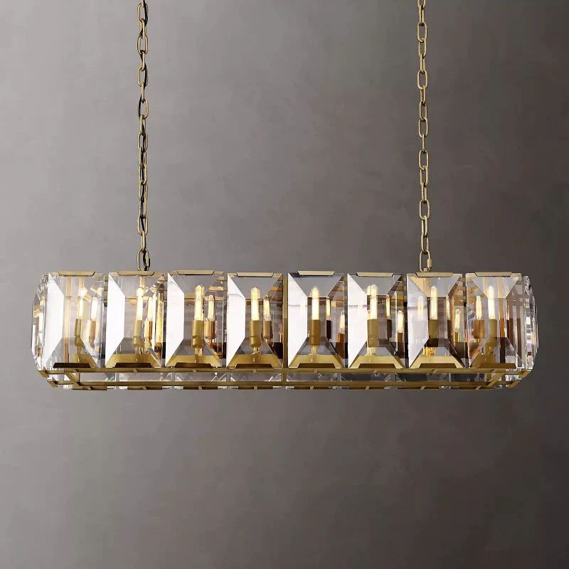
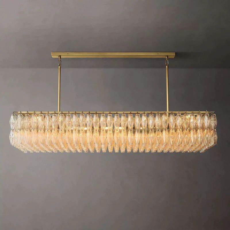
The fixture modifies the light before it reaches the room. Alabaster and frosted glass diffuse illumination and can make the source feel softer. Clear glass reveals the bulb or internal source more directly. Crystal reflects small highlights and may create more sparkle, especially when the individual facets are visible.
A warm source can emphasize the creamy depth of natural stone and brass. A slightly clearer 3000K source may help glass and crystal feel bright without moving into a cool commercial appearance. These are visual tendencies, not guarantees; shade thickness, bulb position, and room surfaces all change the effect.
Compare the glass lighting collection, chandeliers, and the guide to alabaster versus glass lighting to see how material influences texture and visual weight.
Look at color rendering as well as Kelvin
Color Rendering Index, or CRI, is a common measure of how naturally colors appear under a light source. A higher-quality source can help food, flowers, wood, textiles, and skin tones look more convincing. Kelvin tells you whether the light appears warm or cool; it does not tell you whether reds, greens, and other colors will be represented well.
When compatible choices are available, look for the color-rendering information supplied by the bulb or fixture manufacturer. Compare samples in the actual room instead of judging solely from packaging or a phone screen, since cameras and displays can alter the apparent color.
Coordinate with adjacent rooms
Open-plan homes often place the dining room beside a kitchen or living area. Large differences in color temperature are easy to notice when the lights are visible at the same time. A 2700K chandelier next to a 4000K kitchen may look unusually amber, while the kitchen appears blue by comparison.
Exact matching is not always required. A slightly warmer dining zone can feel intentional, especially when it is visually anchored by a table or rug. Keep the difference controlled and repeat finishes or materials so the spaces still belong together. The layered lighting guide explains how several sources can share the work without competing.
Use daylight as part of the test
North-facing rooms may receive cooler natural light, while afternoon sun can add significant warmth. Dark wall colors absorb more light; pale surfaces reflect it. Test bulb samples after sunset, when the chandelier will have the greatest influence, but also check the room during the day if the fixture is used for breakfast or work.
Place sample sources at approximately the future fixture height. A bulb tested in a table lamp may look different once it is reflected by a ceiling, filtered through stone, or surrounded by crystal.
Brightness controls and compatibility
Adjustable brightness can help a dining room move from cleanup or homework to a quieter dinner, but compatibility must be explicit. The fixture, light source, driver, and control all need to work together. Do not install a dimmer or describe a product as dimmable unless its specifications confirm that feature.
Even without adjustable brightness, layered sources can provide flexibility. Wall sconces, lamps, or nearby accent lights can remain on when a softer scene is wanted. For dining room product options, visit the dining room lighting collection.
A simple selection process
- Identify the room's main use: evening dining, everyday family meals, entertaining, or multifunctional work.
- Review the fixture specifications to learn which source types and temperatures are available.
- Start by testing 2700K and 3000K in the actual room.
- Compare how each option affects food, wall color, wood, stone, metal, and faces.
- Check the dining area beside any visible kitchen or living-room lighting.
- Confirm color rendering, output, and control compatibility before ordering.
Final thoughts
For most dining rooms, 2700K to 3000K provides the most dependable balance of warmth, clarity, and comfort. Choose 2700K for a more intimate traditional glow and 3000K for a slightly cleaner contemporary warmth. Consider cooler options only when the room's palette, purpose, and adjacent lighting support them.
Kelvin is one part of the decision. Fixture material, color rendering, brightness, daylight, and layered lighting determine the finished atmosphere together.